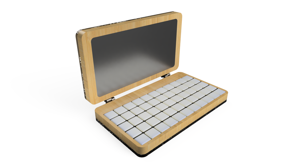
During our product development process we work with different levels of prototypes on our way to the final version. Using prototypes helps us to answer particular questions during the design process and also makes the process itself more agile and open to changes. We just finished a semi-functional prototype of Pocket Reform and are currently testing it. Until this point we have already made a bunch of other prototypes on our way getting there.
What is prototyping?
A prototype is a scaled-down version of a product, a simulation or sample version which enables us to test our ideas and designs even before investing time and money into actually developing the product. Prototypes come in all different shapes and sizes, ranging from simple paper models to fully functional, interactive ones. The best way to think about prototypes is that they’re a representation of a finished product. This representation should have only essential details that help to validate the hypothesis. In the course of product development questions constantly arise which can be clarified with the help of a prototype. The hypothesis is changing with every prototype.
Prototyping is the process of illustrating the idea and functioning of the product. It allows us to quickly build on ideas generated in the ideation stage and observe how people (our team, stakeholders or users) interact with them.
Starting with an initial simple version, prototyping involves a step-by-step approach to a finished end product.
Why are we prototyping?
Prototyping is an extremely valuable step in the design thinking process.
The aim of it is to obtain feedback on the product as early as possible and to incorporate this directly into further development. Putting the user at the heart of the process requires us to test our designs on real users. Prototypes make this possible without spending loads of time and money.
What kind of prototype do we need?
Before we start prototyping we need to know which questions need to be answered.
- Do we want to generate different ideas and approaches?
- Do we want to validate our idea?
- Do we want to communicate the concept?
No matter which type of prototype we choose, it is about understanding and developing the idea and product through several iterations until we get to the final version.
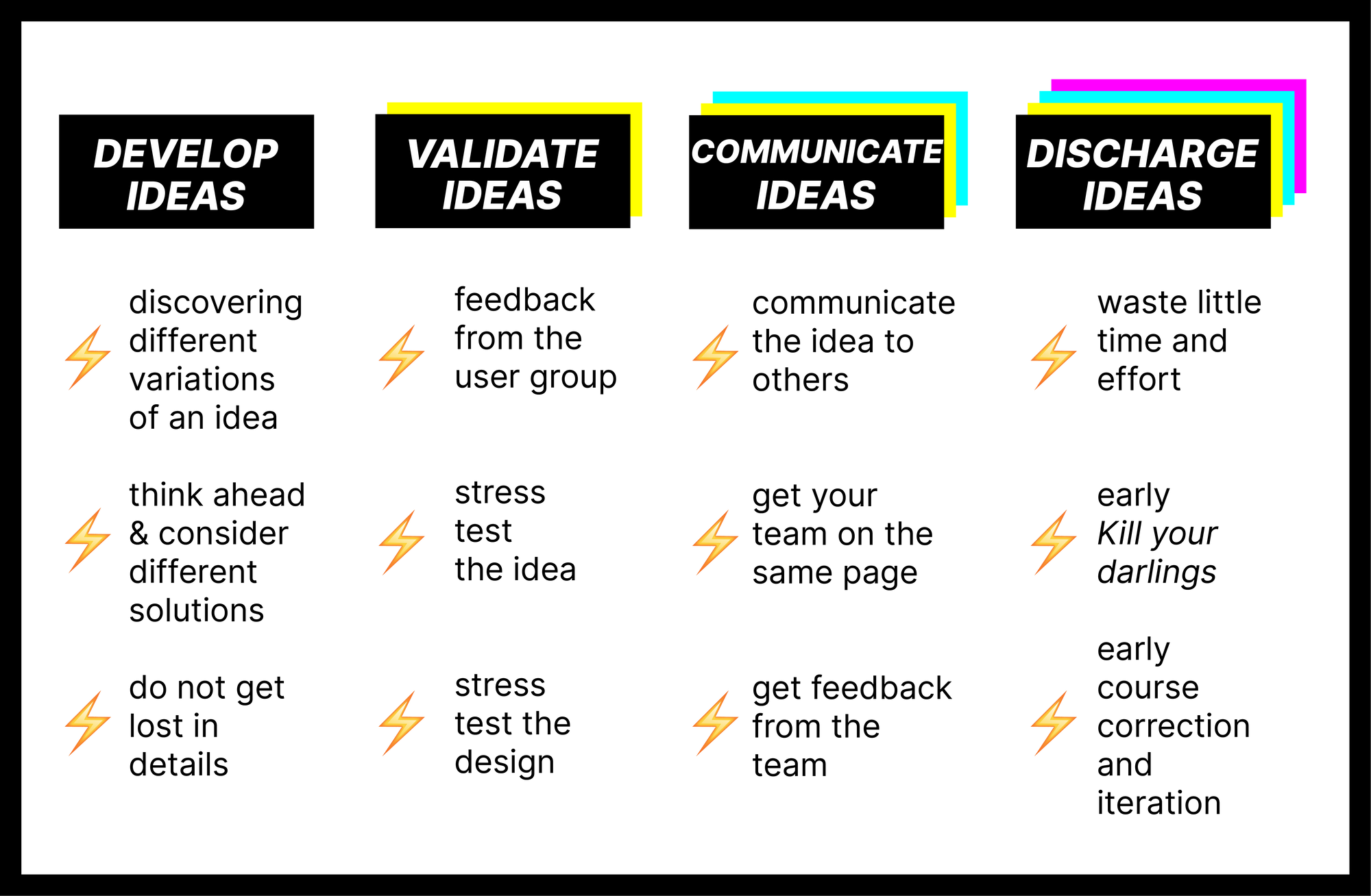
Prototypes can serve as idea generators and validators as well as being the basis for a common language, namely communication via a visual, haptic and representational way. They bring different disciplines to a common denominator. In our team this means designers with engineers, developers, strategists as well as the community of Motion Lab and our funders. Ultimately, however, prototypes are shown to and tested by our user group. The resulting feedback provides decisive starting points for improvements and we can start iterating, building the next prototype and test it again.
Pocket Reform Prototypes
Communication Prototypes
The first Pocket Reform prototypes were made to communicate our idea and an early version of the concept to potential users as well as to our current funders.
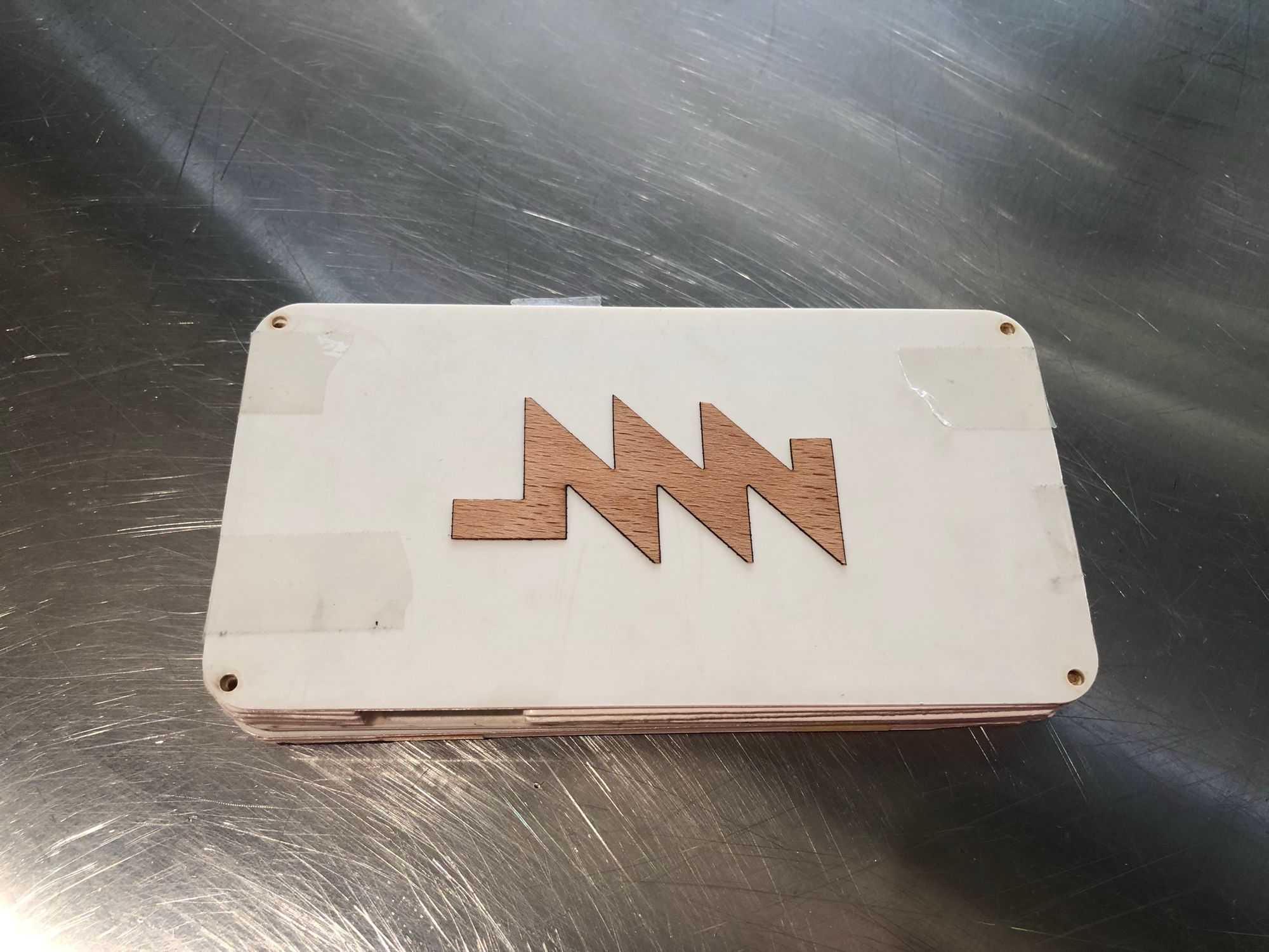
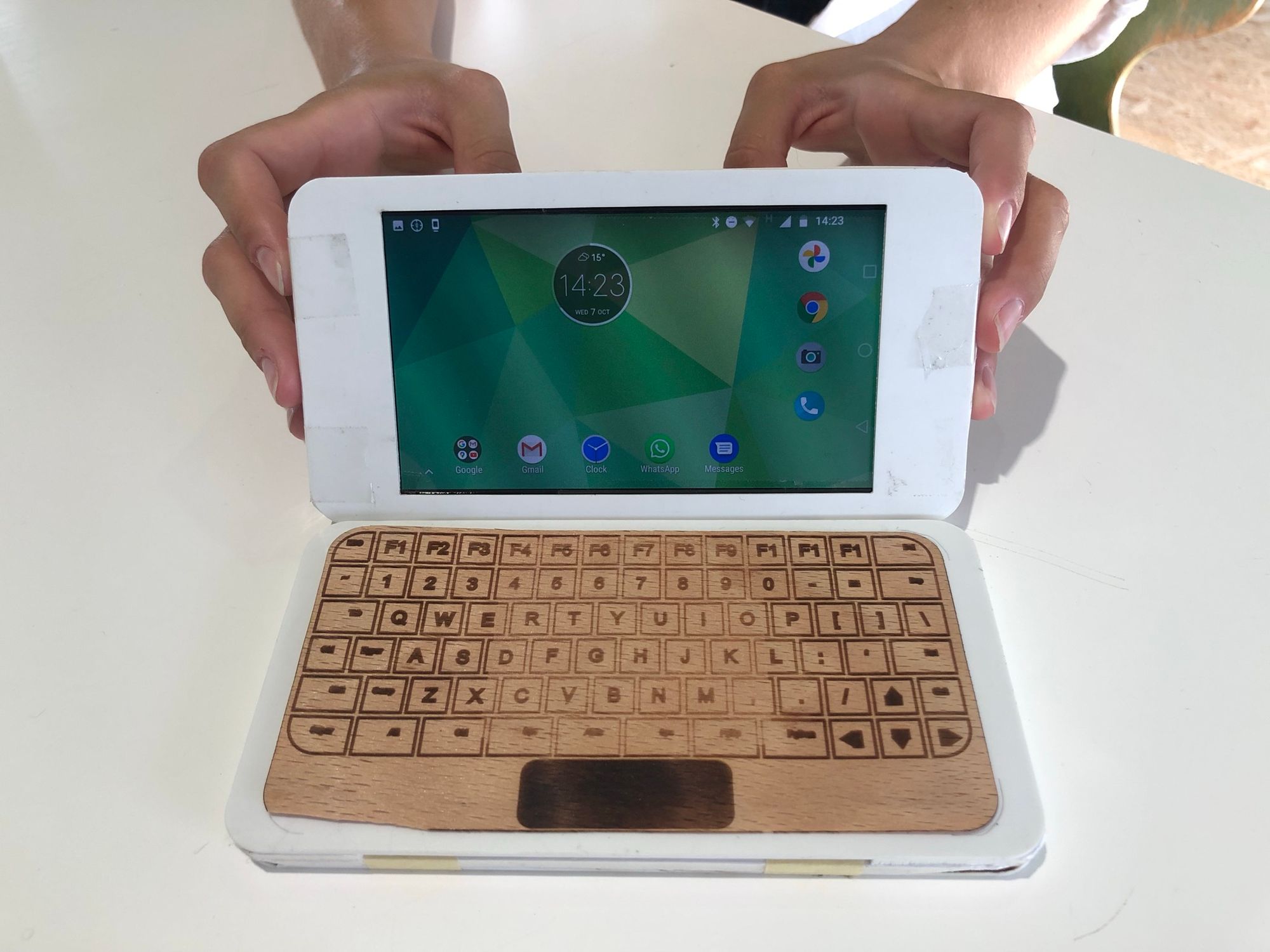
For this we created two different low-fidelity prototypes. One low-key 3D model and one made of laser cut acrylic on the outside and hand cut Kapa foam board as middle layers, fixed by plain tape and featuring one of our smartphones in the casing as a screen. The keyboard and logo is laser cut and engraved 1mm beech wood we found as leftover in Motion Lab. With these two prototypes we could already make our vision of Pocket Reform, a modular open-source device visible and communicate the idea to users and the ones we needed to support us without having an actual product.
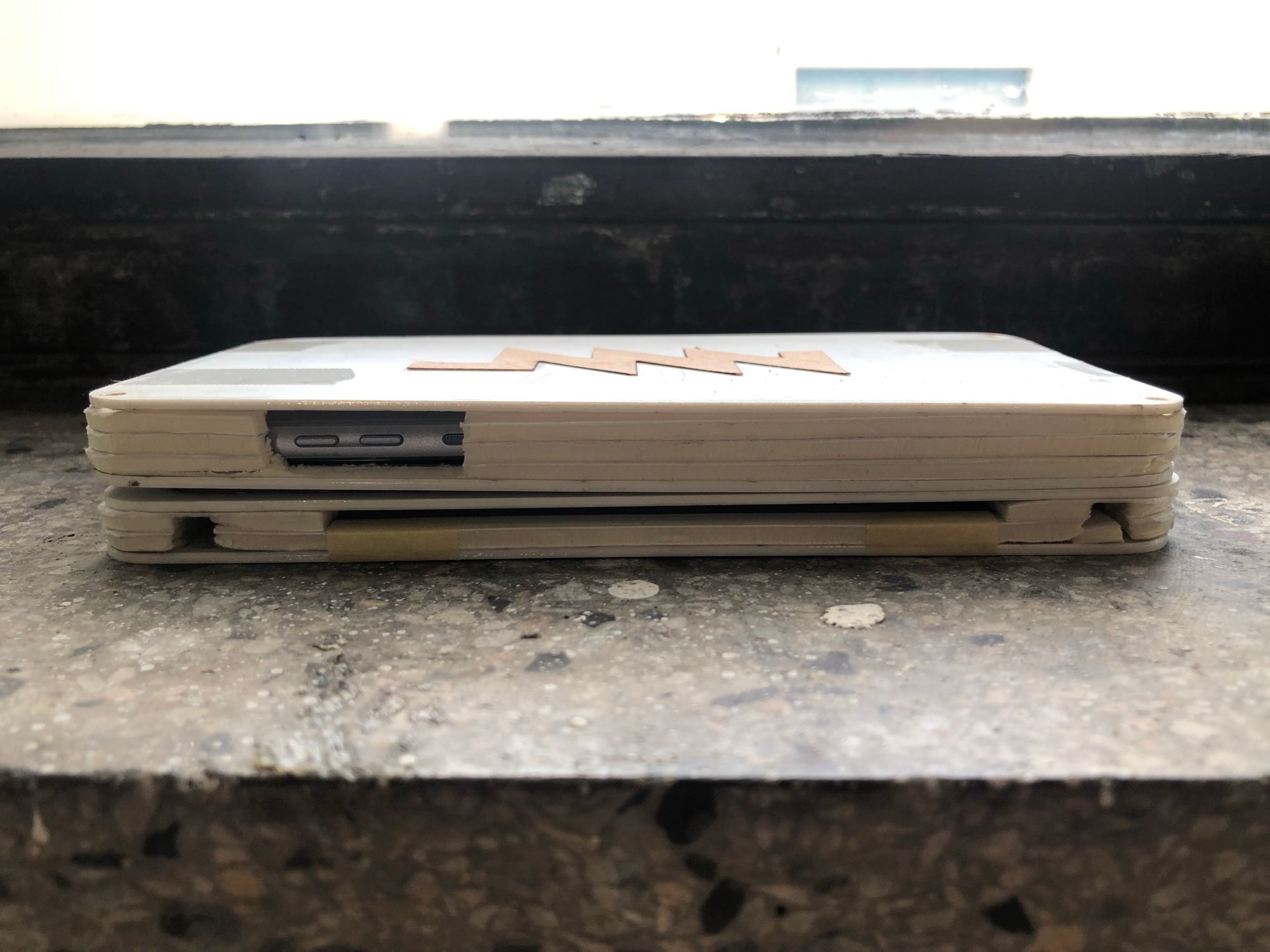
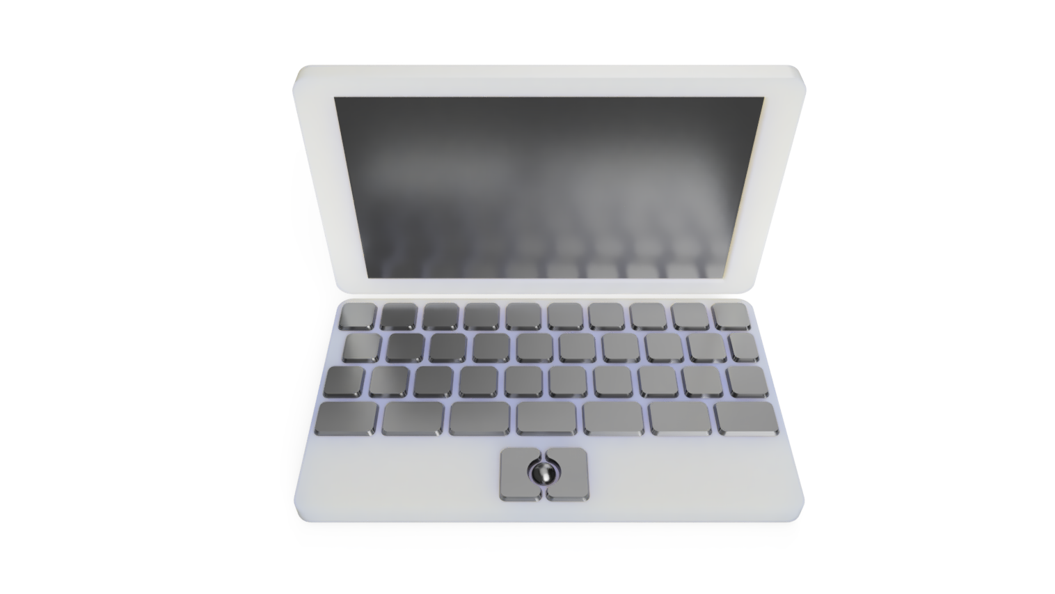
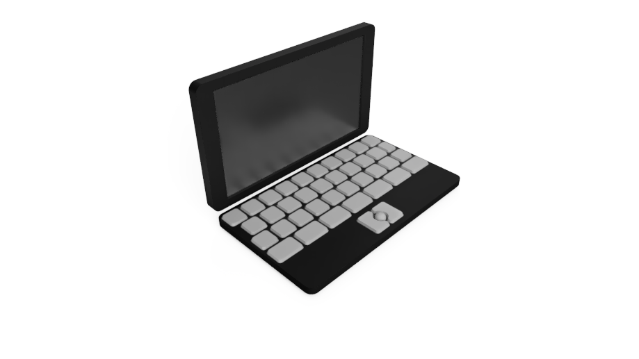
Low-fidelity prototypes for usability
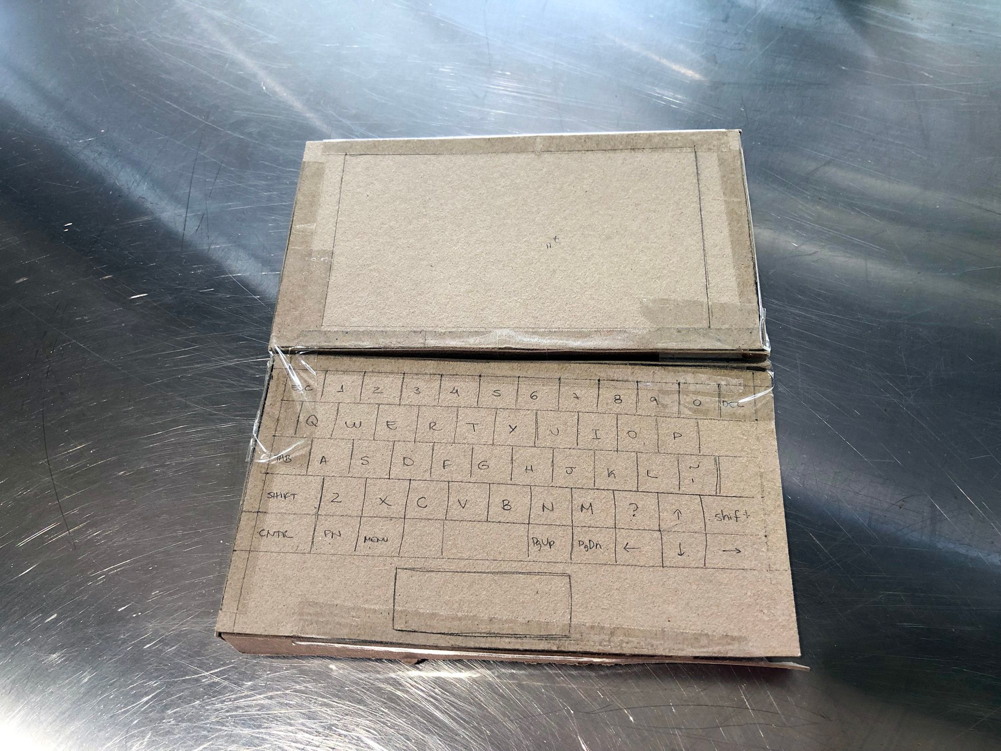
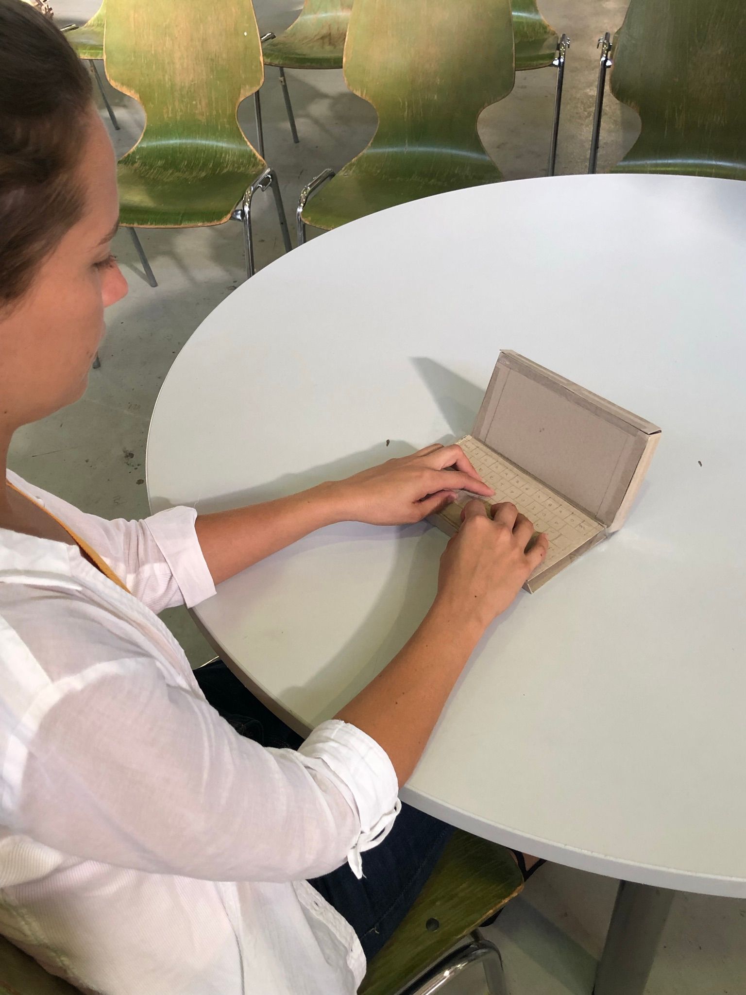
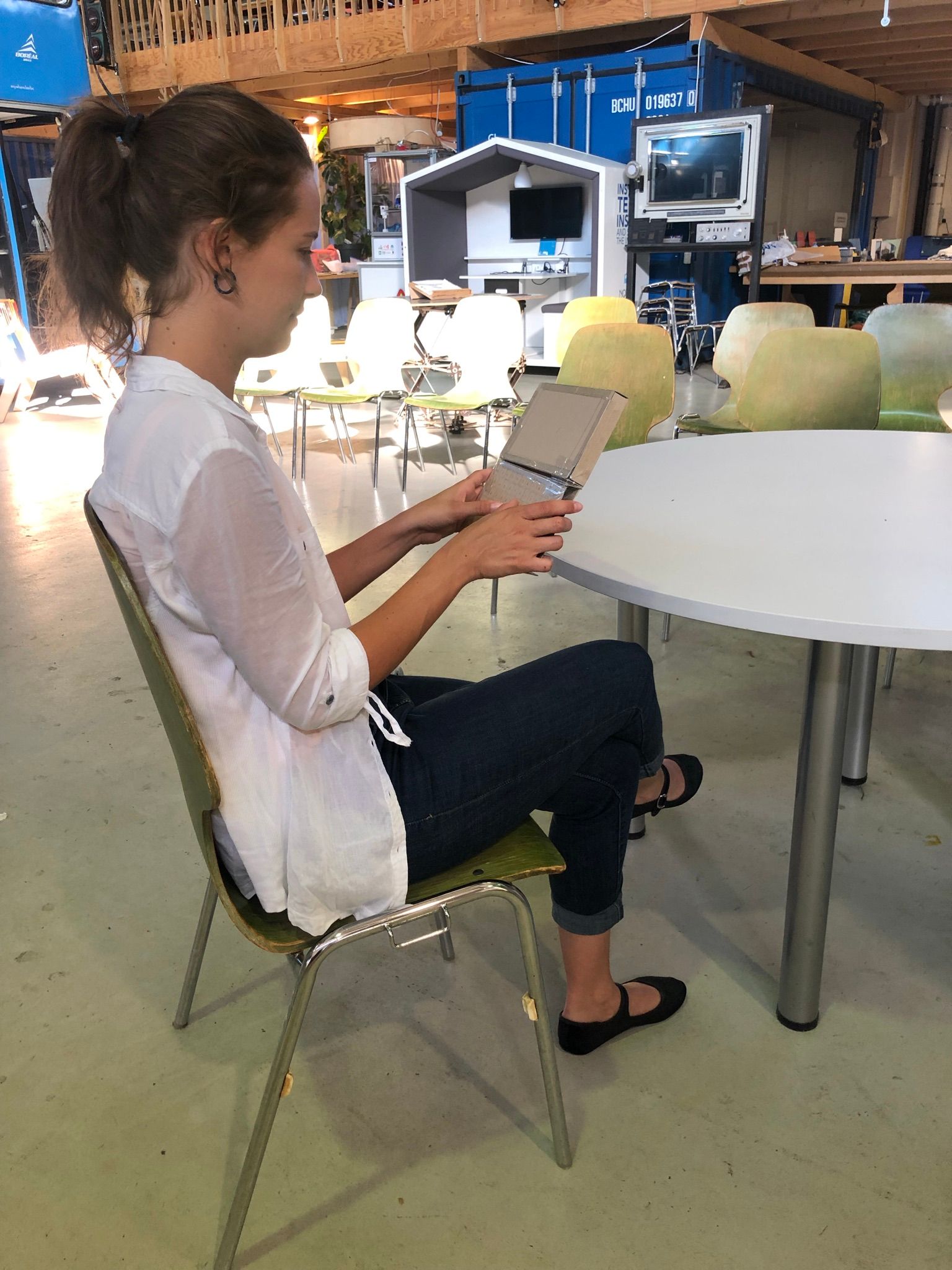
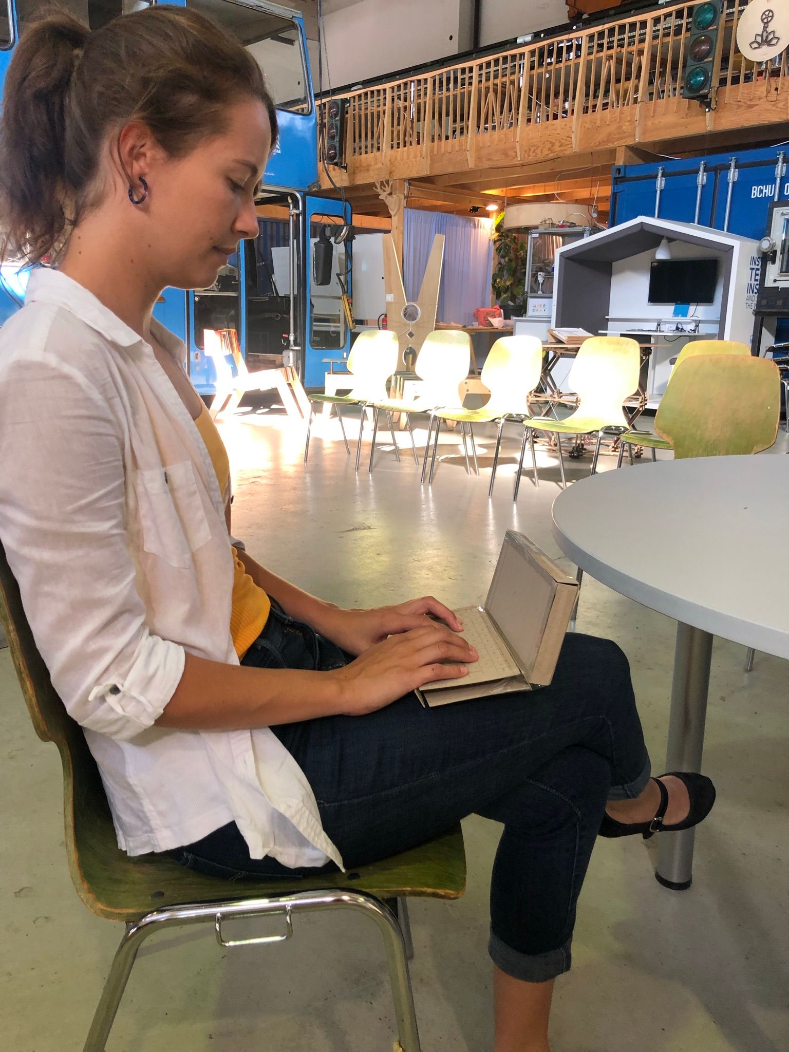
To get a first idea about the size of Pocket Reform we made different versions of super simple cardboard prototypes of 5 to 7 inches screen size and tested how the screen positions, screen distance and typing position felt placing the prototype on the table, lap or holding it with two hands.
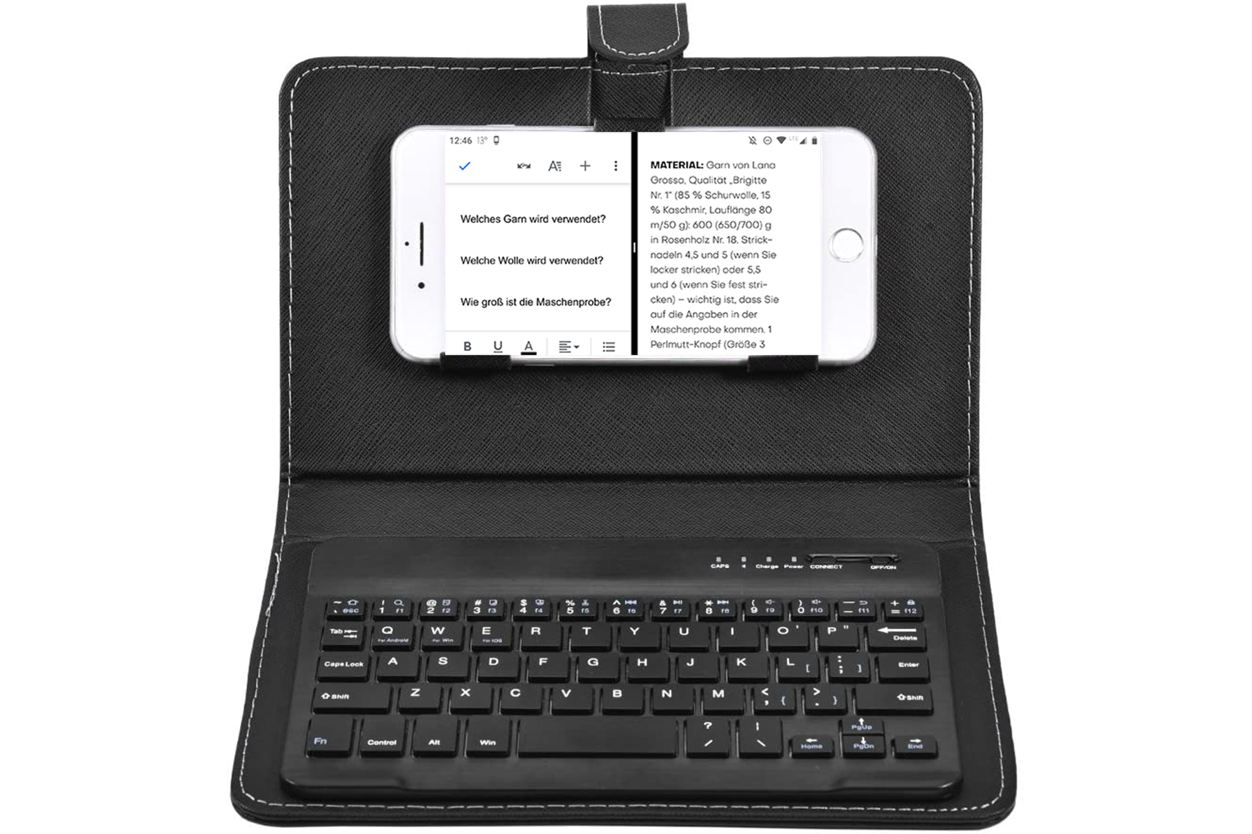
Additionally we tested the screen size and readability of text on an 5.5 inch split screen using a smartphone connected to a bluetooth keyboard with a bunch of users.
Mid-fidelity dummy and semi- functional prototypes
Having a first impression of the size Pocket Reform might have we started building the next level of prototypes which were also a bit more complex. To test Pocket Reform in the field we decided to create one dummy and one semi-functional version of it, including a customised 3D printed keyboard and screen connection. To keep the effort and time invested low, we decided to case both versions in the same housing, which meant we had to exchange the screen part of the prototype depending which prototype version we wanted to use. At the same time we could use one keyboard and case for both.
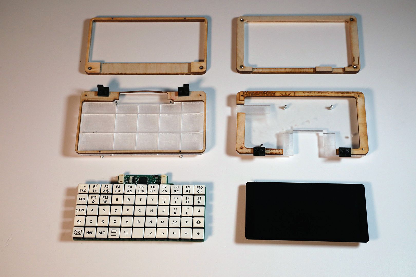
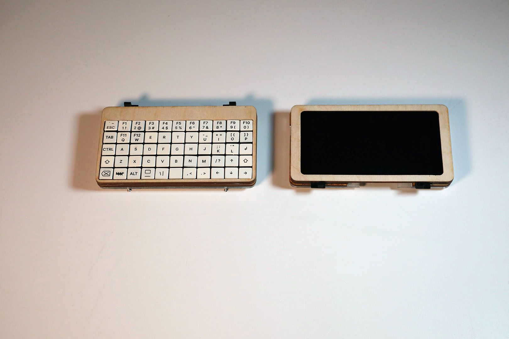
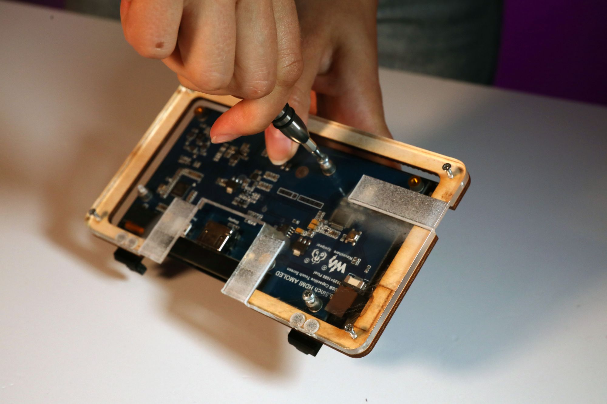
With these prototypes we gain first-hand insights into how our users will interact with Pocket Reform. Seeing an early version of the product in action shows us if and how, it’ll work in the real world.
The dummy version features a smartphone inside as a screen and with this prototype we try to find out about the mobility aspect of the device.
How do our users interact with the prototype while doing specific tasks we ask for?
Whereas the semi-functional one, which features a screen and is connected to an outside processor, is more focusing on the software aspect and applications as well as the user interaction with screen and keyboard. At this stage we can identify usability issues or design flaws. It also helps us to make informed design decisions.
Our following prototypes will be communication ones to give a better impression of how the final version of Pocket Reform will look as well as usability ones to further test the keyboard and navigation.
Find more details on how we created the semi-functional prototype using leftover materials from MotionLab here.

